
Demex Climate Center
A climate risk startup with more data than anyone outside the analyst team could read. I designed the product that made it usable, and wrote the front end for it.
- Role
- Founding Product Designer, also shipped the front end
- Team
- Founding design and engineering team, working with data science
- When
- First public product
- Tools
- Figma, React, UserTesting, Strategy
What shipped
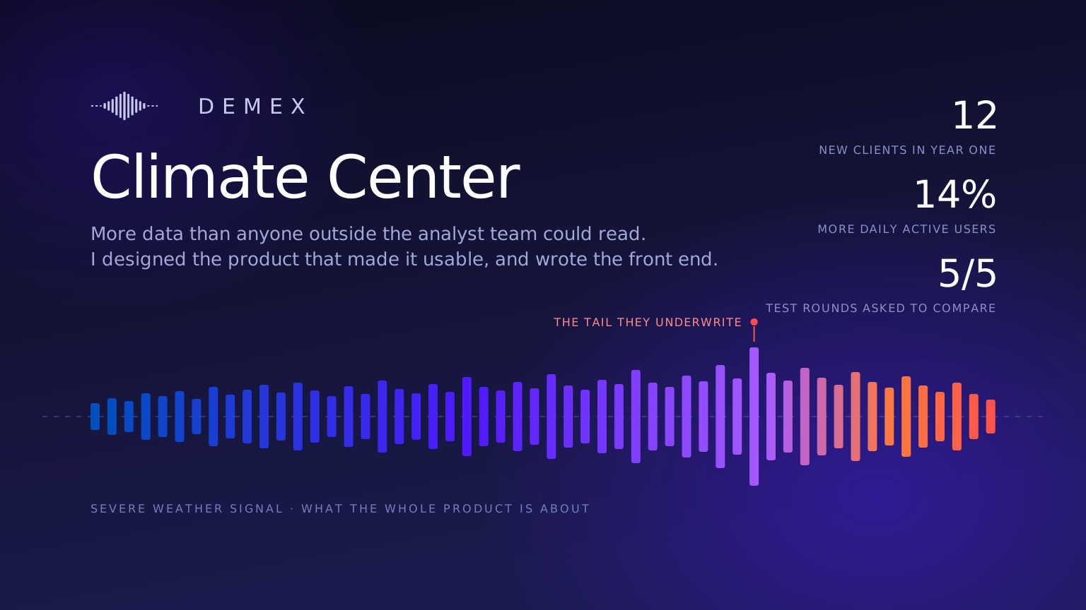
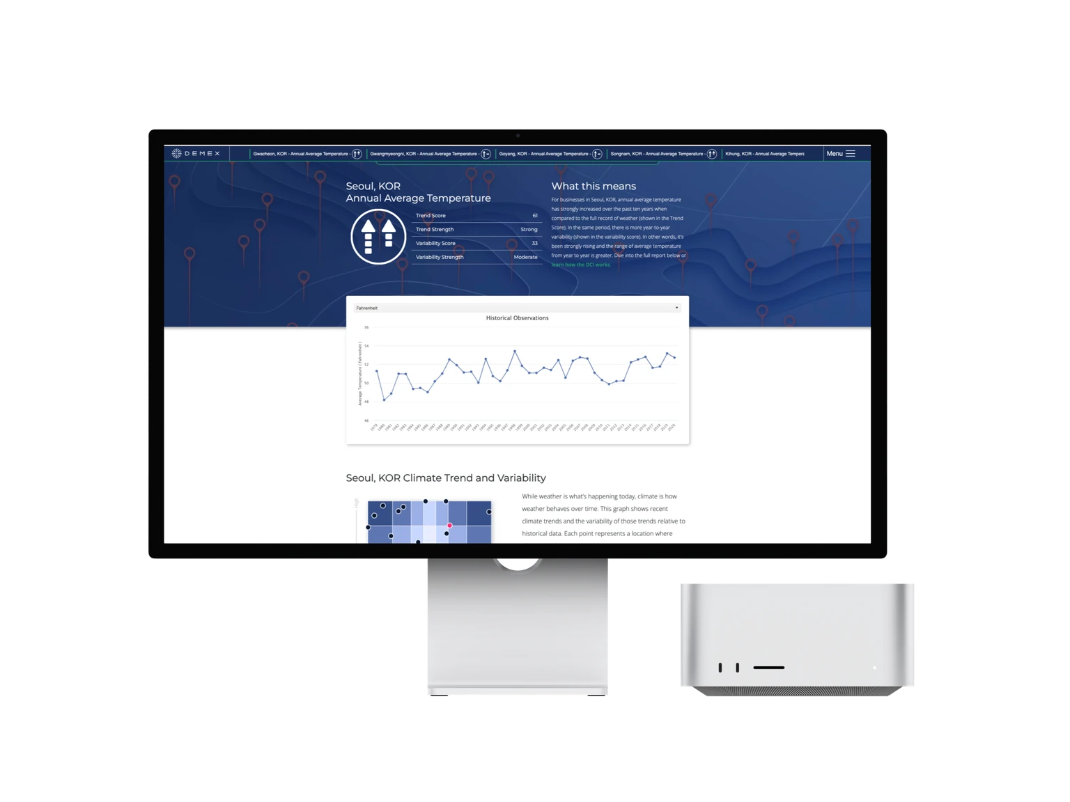
The Demex Climate Center. Pick a location and it tells you how the weather there has been changing, how erratic it has become, and what that means for a business operating in it.
I was the founding product designer. Strategy, research, interaction, visual design and prototyping, and I wrote the front end alongside the founding engineers.
We had the data. Nobody could read it.
Demex sold climate risk products to insurers and to businesses getting hit by severe weather that never rises to the level of a named disaster. The company already held the data. The problem was that reading it required an analyst.
Non-catastrophic weather events in the US are up over 500% since 1980 and have cost more than 9.3 billion dollars since 2002. The people absorbing that had no way to look at their own exposure.
I ran moderated and unmoderated studies with about 50 business owners through UserTesting to find out what they wanted to know. Three findings shaped the product.
78% reported real operational disruption from unpredictable weather. Lost productivity, higher costs, no way to plan around it.
65% of agricultural respondents lose crop every year to weather they did not see coming. Average loss is 15% of annual yield.
63% found their policy did not cover the weather damage they got, which left them paying for it themselves.
Designing the read
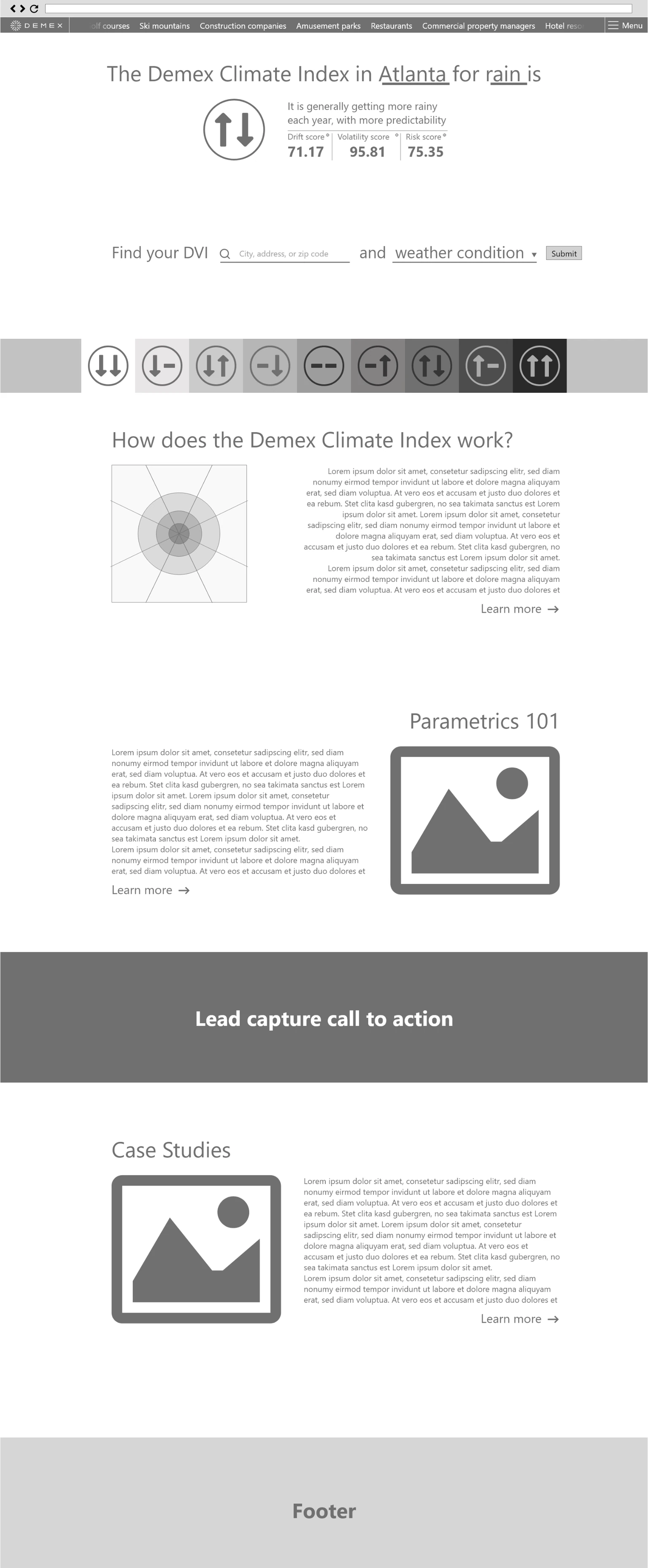
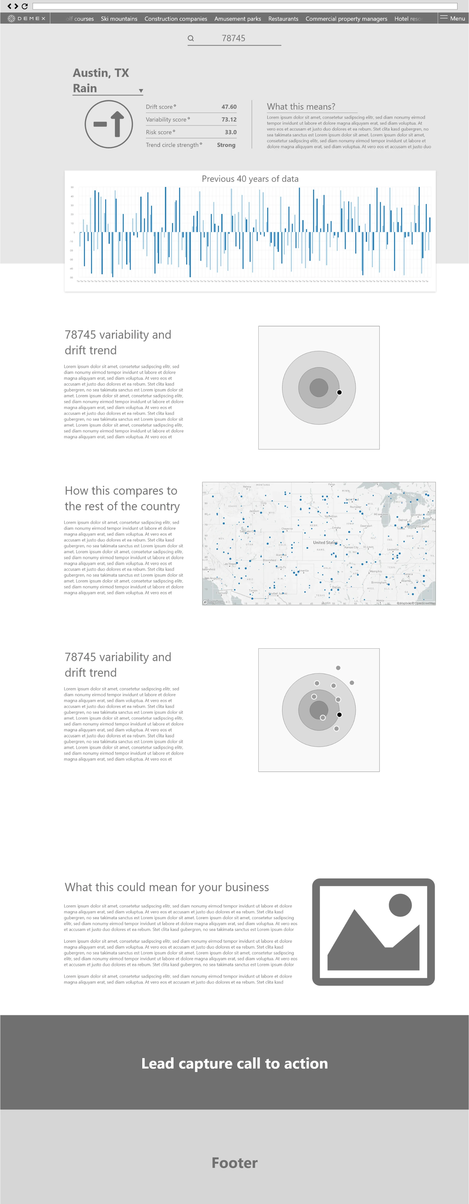
I sketched the home and results screens early to settle the hierarchy before anything got built. One climate index at the top, the trend, variability and risk scores next to it, then historical observations and a comparison view underneath.
The decision that mattered most was putting a plain language explanation next to every score instead of under a help link. A trend score of 61 means nothing on its own. A sentence saying temperature has strongly increased over the past ten years and the year to year range is widening is something a business owner can act on.
Five users changed the product
Once the platform worked end to end I ran moderated sessions with five people to see whether the navigation and the index itself were working.
“4 out of 5 users said they wanted a way to look at this data in relation to other areas.”round-1 testing readout
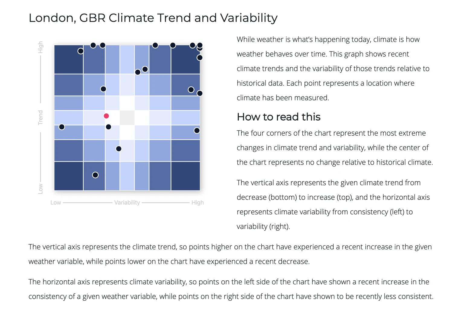
Nobody wanted a number in isolation. They wanted to know whether their location was unusual. That reshaped the next sprint, and we built a comparative view that plots locations against historical data so someone looking at Seoul or London or their own zip code can see where it sits against everywhere else.
Designing it and building it
Being the only designer at a startup means the design is never the constraint. Engineering time is. Writing the front end myself meant the charts, the score components and the comparison view got built the way they were specified, and I could change my mind in code instead of filing a ticket about it.
It also made the stakeholder conversations easier. At a startup somebody will always want a design changed for a reason that has nothing to do with users, and those conversations go better when you have research behind you and can say what the change will cost to build.