
Credit Card Servicing
Two million members, two products that agreed on nothing, and a March 2023 date nobody could move. I designed credit card servicing into the app without forking the design system to do it.
- Role
- Sr. Product Designer, owned credit servicing end to end on iOS and Android
- Team
- Design, Loans, Savings and Credit PODs, iOS and Android engineering
- When
- Jul 2022 sprint to Mar 2023 launch
- Tools
- Figma, iOS and Android, Benchmarking, Usability testing
What shipped
Credit card servicing, inside the app 2 million people were already using, on both iOS and Android, on the date it was due.
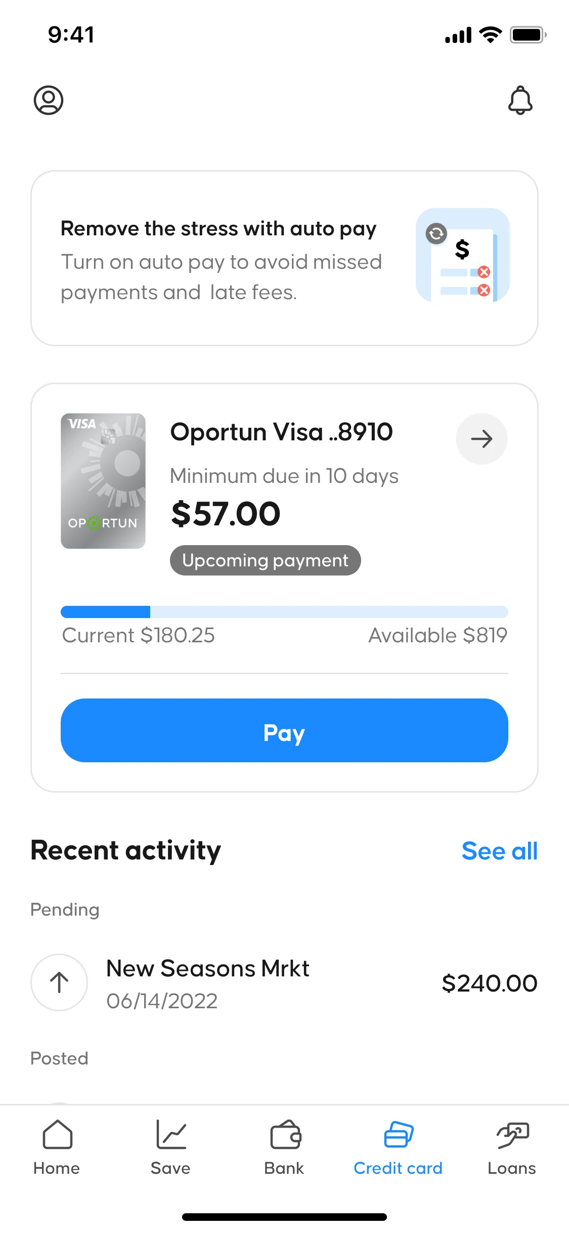
I owned all of it. Account overview, payment flows, auto-pay enrollment, transaction history, and every payment status state, on both platforms.
Oportun had bought Digit, a savings app with about ten years of goodwill behind it, and the two products were being merged into one. That put a savings audience and a lending audience in the same app with completely different ideas about what it was for. The credit card was the newest thing in the lineup and none of the loan infrastructure underneath it fit.
The call that had to happen before any design
The fast answer was to build a separate credit design system next to the existing one. Its own components, its own patterns, nothing shared. It looked contained and it had support already.
I pushed back. Two component libraries doing the same job stop matching each other within a couple of quarters, and members were already confused by the rebrand. The last thing they needed was a second set of patterns to learn inside the same app.
What settled it was the cost. Extending the existing system was slightly more work up front and cheaper on every feature after it, and that was the version product and engineering could agree to.
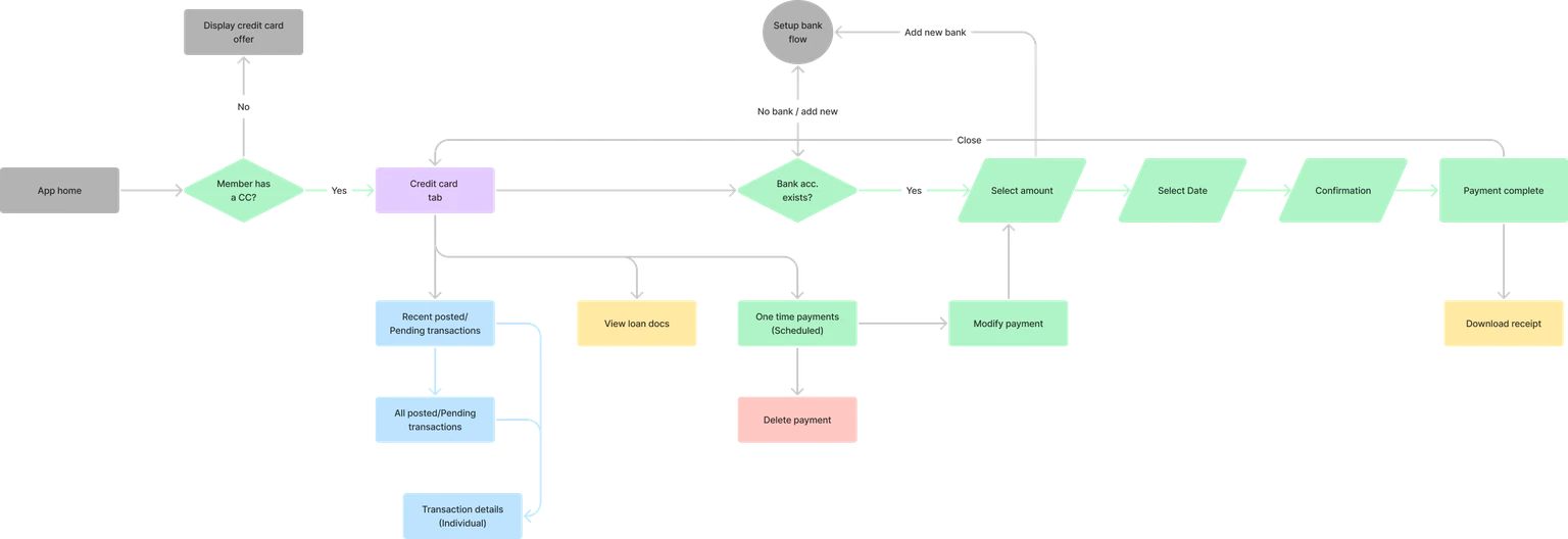
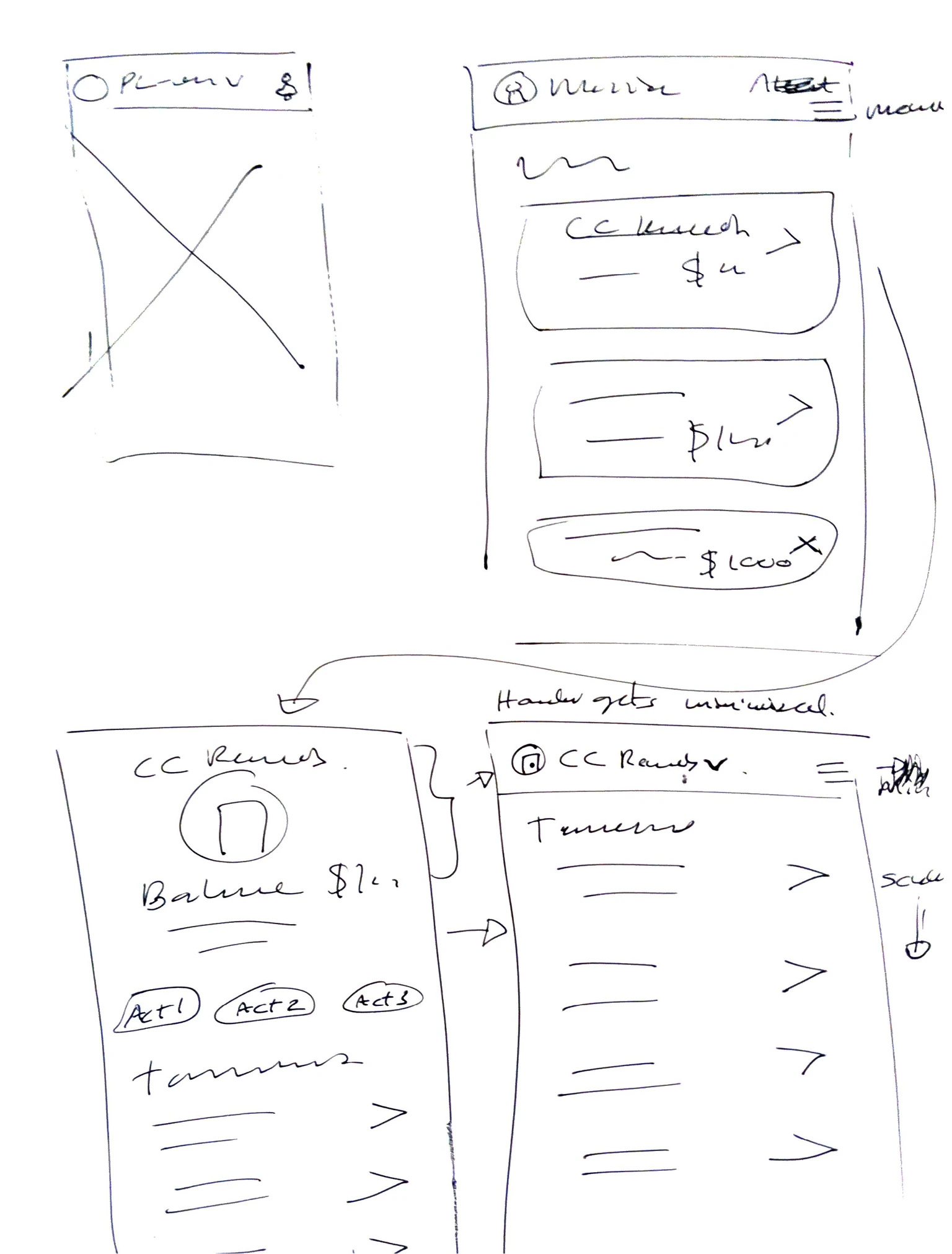
That decision had to be made before anyone drew a real screen, so I spent the first two weeks mapping the whole servicing flow end to end. The map is what showed exactly where loan infrastructure could carry the credit card and where it could not.
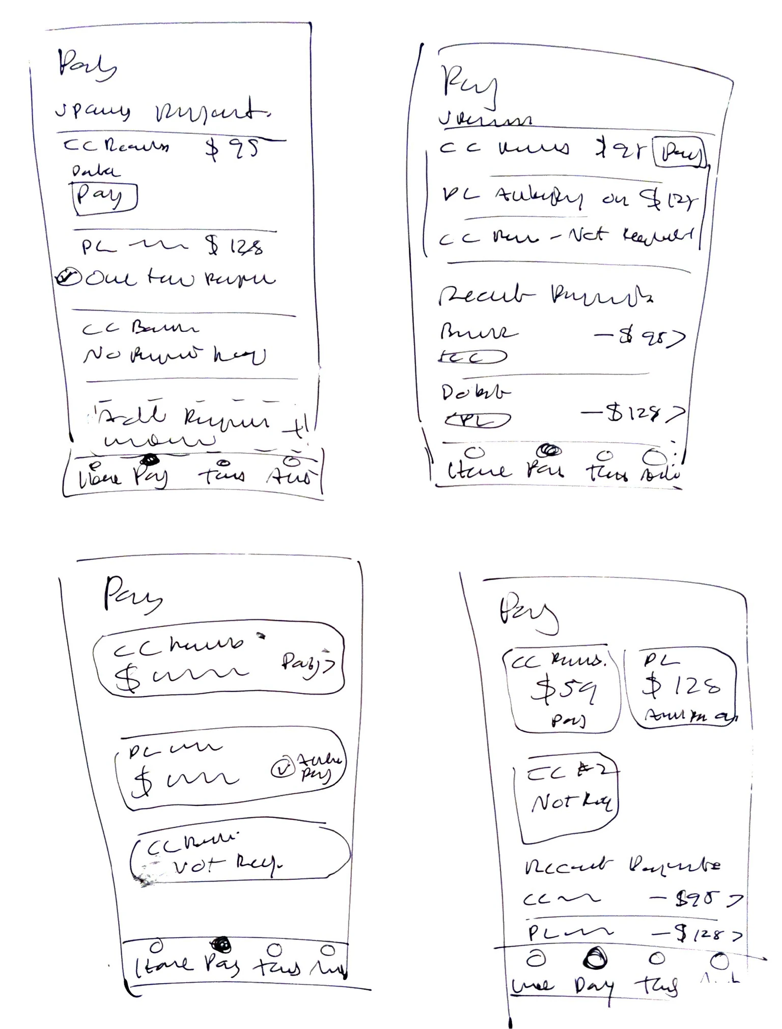
Answering where do I stand
People open a credit card screen for one reason. They want to know whether they owe anything and when.
Reading the support documentation against our usability sessions turned up the thing members never said out loud but were clearly calling in about. The status labels were accurate and still confusing. They had been written to satisfy legal, and legal is not the person squinting at a screen trying to work out whether they are late.
So I pinned the status card to the top of the credit view instead of showing it only when something was wrong. It had to hold three states, each with its own urgency and its own required legal wording, and it had to be readable without using color to carry the meaning, since color on its own does not meet accessibility requirements.
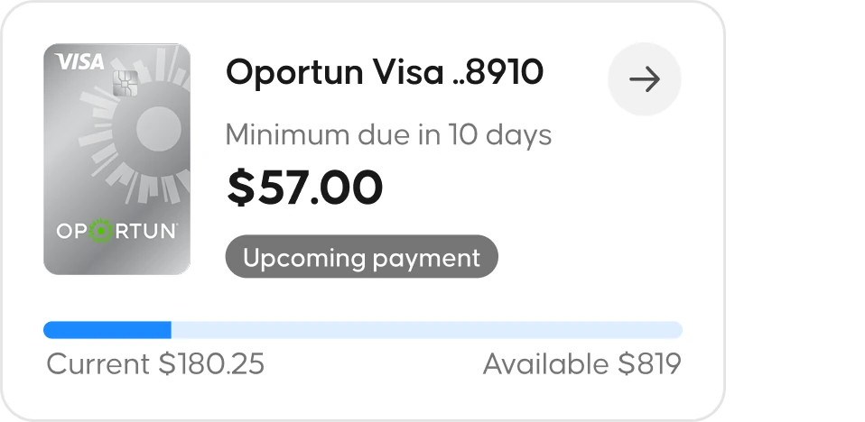
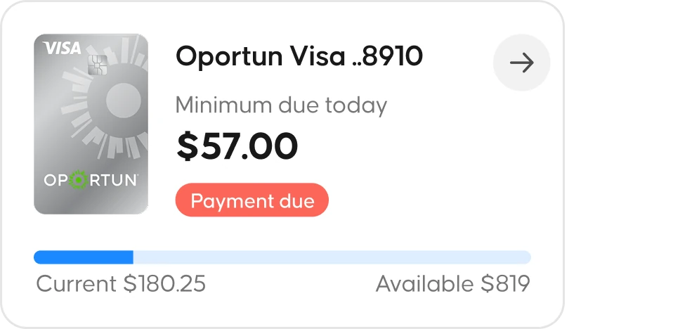
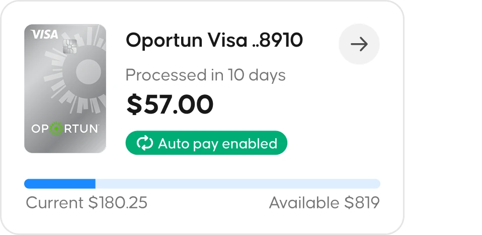
The hierarchy is built from type weight, spacing and a small amount of badge color. Each badge still carries the legally required label, but the layout around it makes the meaning obvious, so the same screen clears compliance and still reads in the two seconds someone gives it.
Fixing the auto-pay drop-off
Auto-pay is the most useful thing a cardholder can turn on. No late fees, no credit damage, nothing to remember. People were starting the old flow and not finishing it.
Two things were causing it. Neither showed up in the data. Both came out of testing.
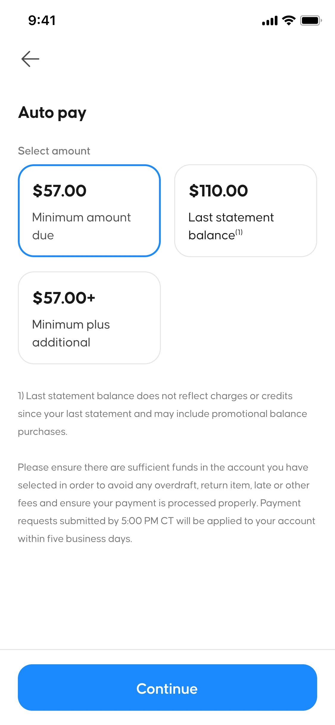
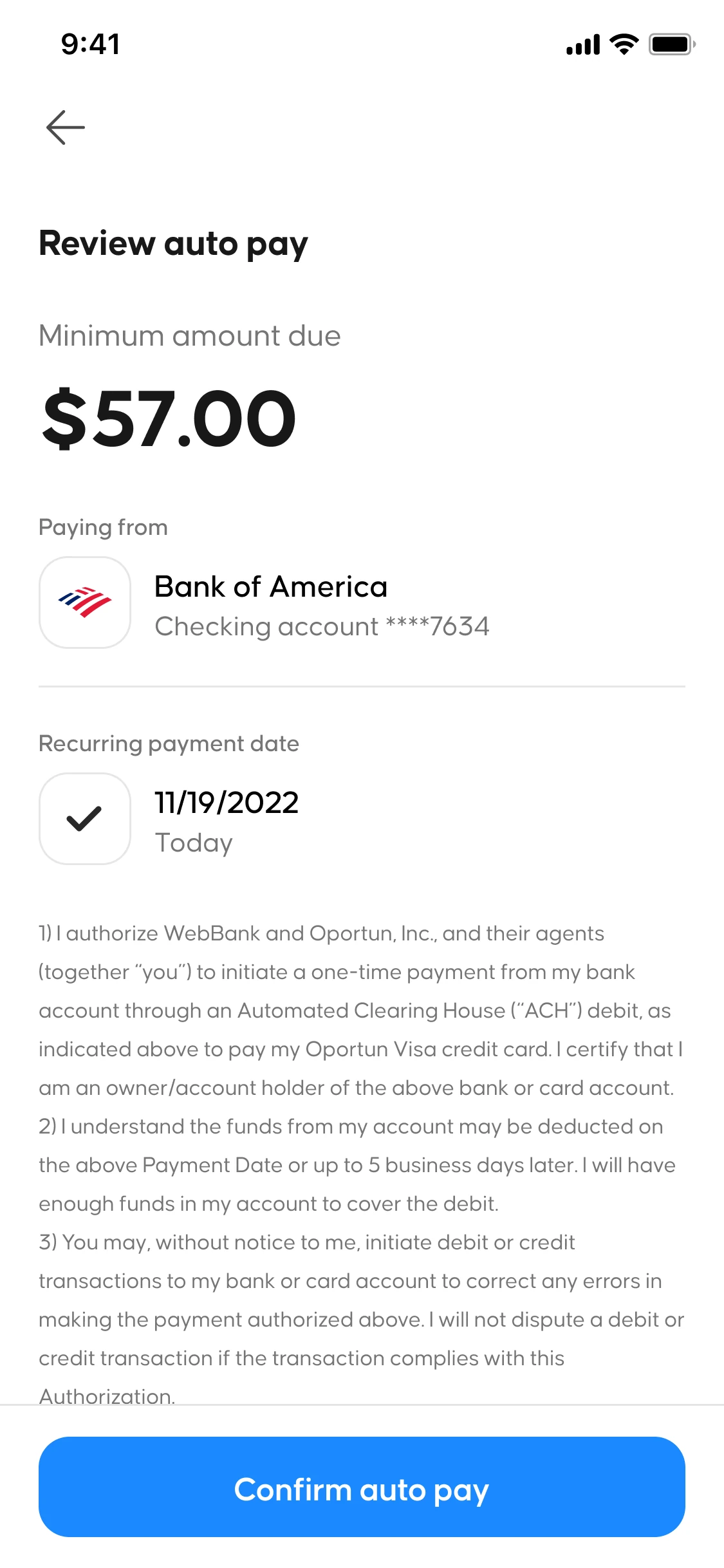
The old flow sent you out to a settings page to add a bank account before you could enroll, which lost people at the exact moment they had decided to do it. I moved funding source setup inside enrollment so someone who has never linked an account can finish in one pass.
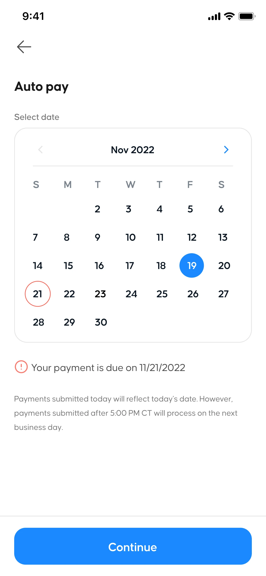
The second one was harder to spot. People were picking payment dates outside their billing cycle without knowing it, so payments bounced or landed on the wrong statement. The calendar now only offers dates that work, and the disclosure sits on the page instead of behind a tooltip nobody taps.
Both platforms at the same time
The normal way to do this is design for one platform, ship it, then adapt the second. It sounds cheaper. What you get is a second platform carrying decisions that were made around the first one's quirks.
On a regulated payment product that stops being a consistency preference and becomes a compliance problem. A payment status has to behave the same way on iOS and Android because the rules apply to both. So I designed them together and specified every status, disclosure and confirmation once for both.
Delivery went out in the order of member impact and regulatory exposure. Account overview, payment flows and the status hierarchy first, then auto-pay enrollment, secure payment and transaction detail on top of them.