Oportun Homepage Widgets
Presenting users with timely and pertinent information about their financial accounts, so they can swiftly take action when managing their finances.
- Role
- UI/UX Designer
- Team
- Design · Loans, Savings, Credit PODs
- When
- 32 weeks
- Tools
- Figma · A/B testing · Heuristic eval
Problem
Earlier in the year, the Oportun app went through an enormous redesign. Oportun acquired Digit and the name of the app changed. Alongside the rebrand was also a redesign of the app and our product offerings.
Our business goals were to bring back our retention rate and member-lifetime rate to what those numbers were historically, and to improve new 30–90 day retention.
Goals
- ▸Move away from "feature ads" toward contextual prompts that help users learn and adopt new features
- ▸Increase baseline metrics for SAVE, Loan, and Credit Card products
- ▸Create real space for financial insights
- ▸Establish a baseline future iterations could build on
What we knew
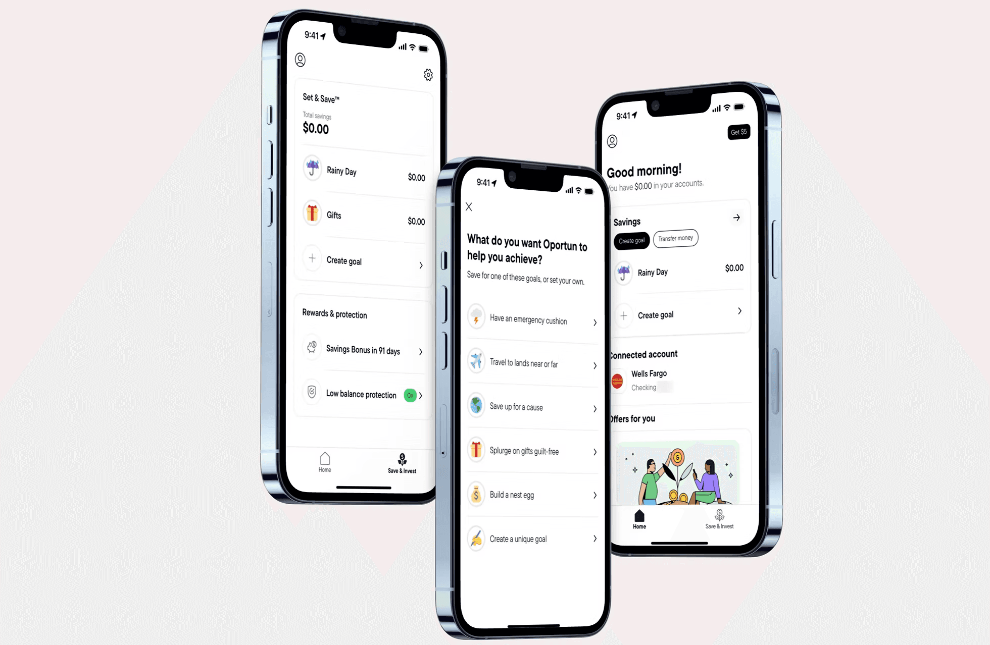
For the first 10 years that Digit was a service before the 2021 Oportun acquisition, they were a company that helped users save by linking their bank accounts and saving for future goals. That was the mental model our users had grown accustomed to. Post-acquisition, the app was rebranded as a savings account that came with a $5 subscription fee.
The data showed a high level of churn that our users had been experiencing for some time. We started to see a large disparity in our referral numbers as well as our app store ratings.
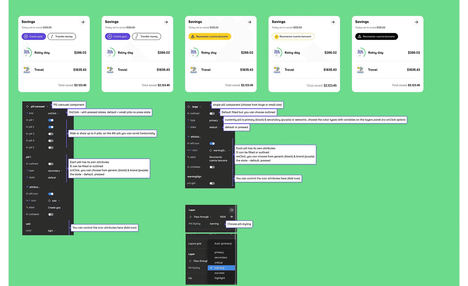
A heuristic evaluation of the app showed where we needed to fill the gaps. We had a lack of showing users system status, and we had some of our most important actions buried within sub-pages.
Challenges & opportunities
Resistance from executive leadership
After being named the leading savings app of 2023 by Bankrate and several other platforms, executive leadership believed there was no need for alteration. We had to show them, not tell them, what the data was saying.
Uniformity across product teams
The product area was wholly owned by the stakeholders, not the designers, and they ultimately had final say on whether or not a feature would be shipped. Buy-in had to be earned across multiple PODs, not won once at the top.
Hypotheses
- ▸Introducing product actions to the app would increase savings, loan-payoff rate, and other core product actions, while rebuilding trust with long-term members
- ▸Increasing and improving our just-in-time system statuses would help us retain new members because they would now be able to see success sooner
- ▸By moving core actions to the homepage, we could begin to build it into a financial insights hub we could then use to activate users into new product offerings
My process
To begin, we started off with a pretty straightforward A/B test. After meeting with the Loans team stakeholders, my team and I were able to convince them to funnel a percentage of their web traffic directly to a page where users could pay their loans, set up auto-pay, and see relevant loan information.
The test was a quick win
We saw that users were 2–3× more likely to set up auto-pay or pay their bill on time when given the action directly versus only the information.
Getting project buy-in
A large portion of the project was selling and re-selling this work across the company to a wide range of stakeholders. By collaborating with designers, devs, and PMs, we were quickly able to grow a coalition of product members advocating for the launch.